Celebrating a Decade of styled-components


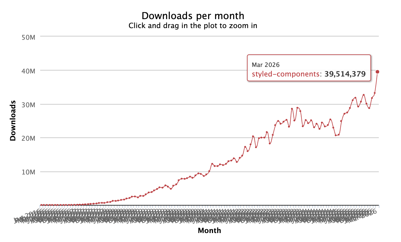
10 years, 1.5 Billion downloads, 350+ contributors, 191 releases. A thriving ecosystem of libraries, tools, and integrations. I couldn't be more proud of where the css-in-js community is today. There are a thousand different frontend CSS solutions out there, but we still are growing and accelerating!
Where It All Began
In October 2016, Glen Maddern and Max Stoiber asked a deceptively simple question: what if CSS lived inside your components, not alongside them? What if styled primitives were the component? That question changed how a generation of React developers thought about styling.
Using tagged template literals—a then-novel JavaScript feature—the library let developers write real CSS inside their JavaScript. No class name collisions, no separate stylesheet files, no mental mapping between components and their styles. It resonated immediately.
import styled from 'styled-components';


// The syntax that changed everything
const Title = styled.h1`
  font-size: 1.5em;
  text-align: center;
  color: palevioletred;
`;
Adoption was swift. Startups and enterprises alike picked it up. The npm downloads climbed past hundreds of thousands per month. The GitHub stars accumulated into the tens of thousands.
The Journey So Far
October 2016: The First Commit. Glen Maddern and Max Stoiber release styled-components, introducing tagged template literal CSS to the React world.
2017: Community Explosion. Phil Plückthun joins as core contributor, building the Babel plugin that powers server-side rendering and smaller bundles. The ecosystem grows rapidly—jest-styled-components, the VS Code extension, and more.
2017–2018: v2, v3, v4 — Rapid Evolution. A series of major releases bring dramatic performance improvements (including a 10x speed boost in v3.1), along with native theming, React Native support, and the .attrs API.
2017–Mid-2019: Evan Jacobs Becomes Primary Maintainer. While working at Zocdoc, Evan (quantizor, formally known as probablyup) started contributing in 2017. His team wanted to use React 16's new streaming server rendering, but styled-components didn't support it, so he built the first streaming SSR implementation and contributed it upstream in January 2018. That pulled him deeper into the codebase. By mid-2019, after Phil Plückthun's last major merge (the hooks rewrite into the v5 canary branch), Evan had become the project's primary maintainer.
January 2020: v5 "Beast Mode". A rebuilt core stylesheet engine delivers 50% faster SSR, 22% faster client-side rendering, and a 31% smaller bundle. Hooks replace class components under the hood.
2020–2023: v6 — The TypeScript Rewrite. The v6 planning discussion opened in November 2020 (#3333). The first alpha landed in February 2022 (#3696), the beta feedback thread opened in September 2022 (#3800), and v6.0.0 shipped in June 2023. This was a ground-up rewrite in TypeScript—1 to 2 years of work, all before the age of AI-assisted coding. Shipping built-in types meant users could finally drop @types/styled-components, but it also meant the project now owned every type bug directly.
March 2025: Maintenance Mode & Gratitude. A heartfelt "Thank You" post transitions the project into maintenance mode. The library continues to receive fixes and improvements.
2025–2026: Still Shipping. The v6.3.x line continues to ship fixes for things like React 19 hydration, StrictMode compatibility, and Shadow DOM SSR. In addition, v6.4.0 ships with major new features including createTheme, RSC improvements, and significant performance gains.
"Maintenance Mode" ≠ Dead
When the project entered maintenance mode in March 2025, a lot of people heard "abandonware." Blog posts titled "RIP styled-components" started appearing.
The simple truth is I felt that the API surface of the library with few exceptions was well-formed and stable, I was burnt out, and the future was hazy. I had recently been laid off from my full-time job and open source had to take a back seat for a time.
I started doing some consulting and through that process I tried a lot of the newer ecosystem frameworks like Tailwind and Shadcn. Simply put, they're great. They solve a particular class of problem very well, but they're not the only solution.
styled-components fills an important niche in the ecosystem:
- It handles a wide range of dynamic styling patterns naturally.
- It is inherently portable; template literal CSS, CSS objects, and other supported CSS formats can be used for web, native, and perhaps other platforms in time.
- It doesn't require a build step.
And, most importantly, people still use it and usage is growing. The vibe coding revolution is not exclusive to Tailwind, we have a place too and plan to be around for as long as CSS remains relevant in software engineering.
What's Happening Right Now
Newer agentic coding models like Anthropic's 4.x Opus allow me to experiment 10x faster than I ever could have before, especially with limited free time. You're seeing the early fruits of this technological renaissance in this most recent 6.4.0 release:
createThemefor CSS Variable Theming: A newcreateThemeutility enables CSS custom property theming that works across both RSC and client components (no React context needed). Includestheme.resolve()for reading computed values from the DOM.- Significant Performance Gains: Re-renders that don't change styling now skip style resolution entirely. Many algorithmic improvements and careful introduction of safe caching. Most applications will see a 1.5-3.5x improvement depending on workload.
- Dropped IE11 & Slimmed Dependencies: ES2015 build target, inlined unitless CSS properties, removed the @emotion/unitless dependency.
- Rearchitected Global Styles:
createGlobalStylenow uses shared stylesheet groups with deterministic definition-time ordering, fixing long-standing SSR memory leaks and multi-instance unmount bugs. - First-Class CSP Nonce & Better .attrs(): Nonces configurable via
StyleSheetManager,ServerStyleSheet, or<meta>tags. Props via .attrs() are now automatically made optional. - React Native: Replaced postcss with a lightweight CSS parser, fixing
nanoidcrashes in Expo/Metro and improving parse speed 4–6x. See the full changelog for more details.
Looking Forward
The team at Sanity opened PR #4332 implementing useInsertionEffect, which showed up to 40% faster initial renders in testing at Linear. When the PR sat longer than anyone wanted due to the realities of solo maintenance, they published a fork to unblock their own migration timeline. I want to thank the Sanity and Linear teams for helping to support the ecosystem during a period of uncertainty; I hope you will try the 6.4 release and continue to bring feedback and ideas to mainline.
I have started to think about what a new major release might look like. I am not planning to change the public API meaningfully, but some backward compatibility support for older versions of React and React Native will end in order to best support the new normal of RSC and whatever React comes up with next.
At this point in time, what styled-components needs is funding. We need to rebuild our financial foundation to support the project long-term. Funding allows me to focus on the project outside of my personal time, consistently maintain larger portions of the ecosystem, and to more consistently compensate contributors for their work.
The Open Collective has tiers from Enthusiast ($5/mo) through Diamond ($5,000/mo); the highest tier includes priority support and even a number of private engineering hours from me per month for migration help and more.
If you run a profitable business that relies on styled-components, please consider chipping in.
Thank You
To everyone who made styled-components what it is.
Core Team: Evan Jacobs (@quantizor), Glen Maddern (@geelen), Max Stoiber (@mxstbr), Phil Plückthun (@philpl), @schwers
350 contributors. 3,822 commits across 191 releases. An entire ecosystem—jest-styled-components, the VS Code extension, the Babel plugin, polished, xstyled, and countless community libraries in awesome-styled-components. To every single person who opened a pull request, filed an issue, or simply chose styled-components for their project: thank you.
Past sponsors & backers: Icons8, Practice Ignition, InVision AG, Coinbase, Easy Agile, Tesorio, Dutchie, Frontend Masters, Sanity, Airbnb, Trivago, and hundreds more.
If styled-components has been part of your stack, the most direct way to keep it maintained is Open Collective.